Building a Brand Part 1: Rebranding & Refreshing
About This Project
Kings and Balducci’s are a pair of heritage retail brands that have been offering specialty store shopping experiences to their guests for several decades. Centered around the finest foods and expertly crafted chef-prepared offerings, Kings and Balducci’s each built a reputation on an upscale, gourmet food experience. Unfortunately the branding for the pair of companies has not kept up with the level of offerings available at their stores. Kings formerly utilized a whisk logo that felt dated on shelf and out of touch for a modern market. Balducci’s utilized a script ‘B’ and color palette that failed to convey the level of care and artisanship that went into the offerings available in their stores.
New logos were designed to update the brands’ positioning in an increasingly crowded market being quickly invaded by the likes of Wegman’s, Whole Foods, and more.
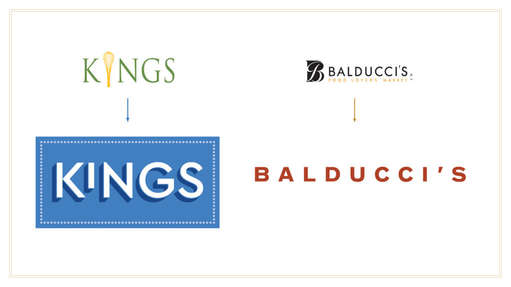
I was brought in to work with the Senior Creative Director on building and expanding the visual vocabulary for each brand. When I joined, new logos had been ratified and there was a need to demonstrate how the new color schemes, typefaces, and logos could all work together to differentiate Kings and Balducci’s on the shelf, in stores, and in neighborhoods.
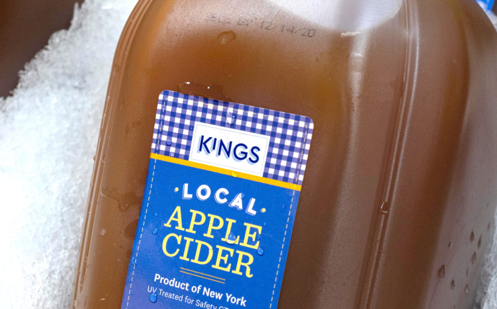
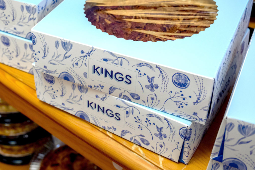
Kings’ brand elements were designed to include a gingham pattern that was reminiscent of textiles and high quality, familiar clothing. A proprietary toile pattern was also developed, as an illustrative way of representing the myriad of offerings available in store.
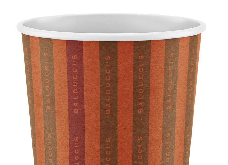
In refining the Balducci’s branding, we developed a system of asymmetric and symmetric stripes that could be paired across communications, packaging, and on digital to make use of the new color palette which tapped into the rich world of spice colors.
Brand elements do not develop themselves in a vacuum though. So we turned to Private Label as a key differentiator for each brand.
FIND OUT MORE ›